Corporate Identity - Campaigns
Kypseli Municipal Market – Corporate Identity – Brand Manual
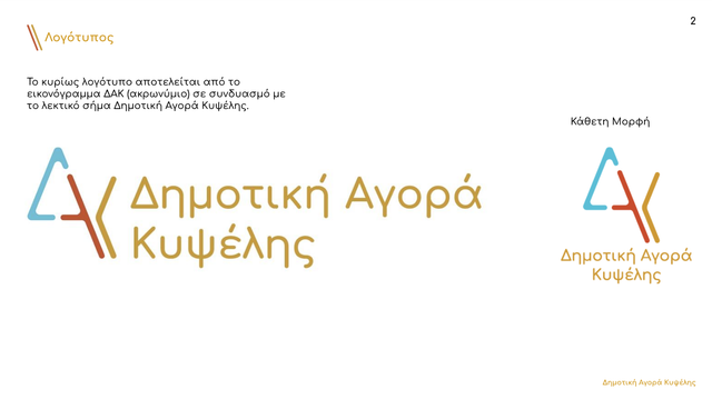
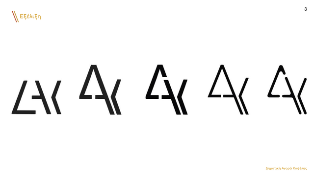
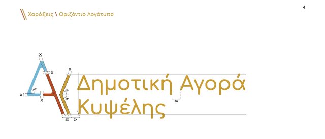
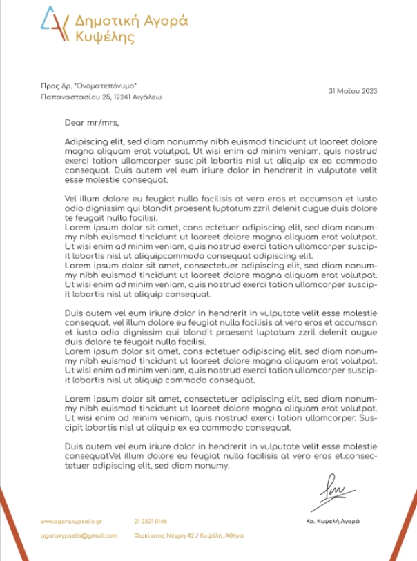
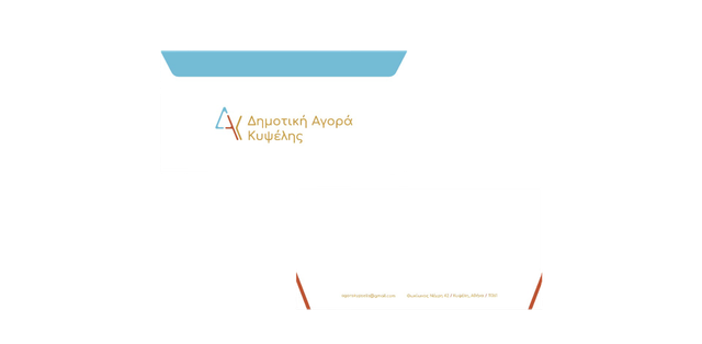
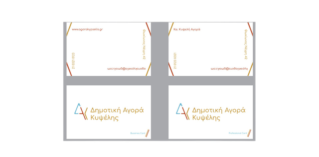
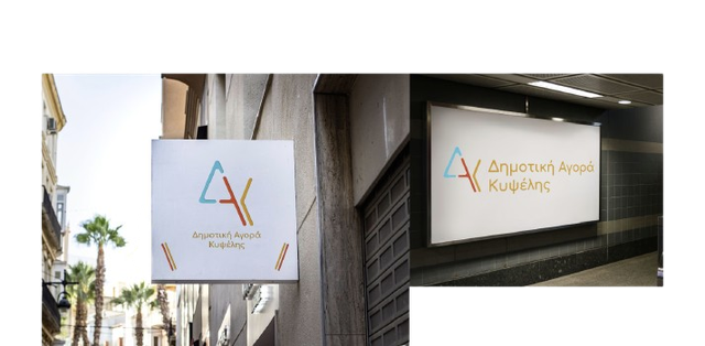
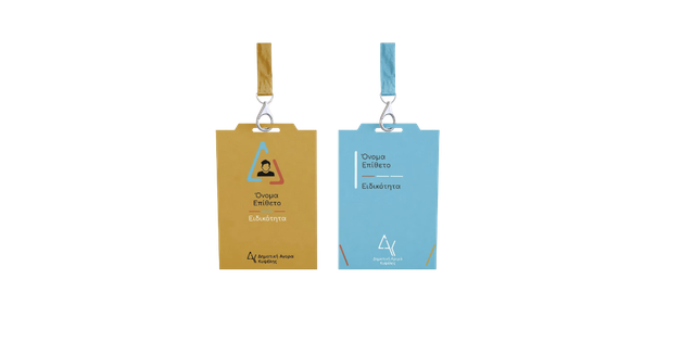
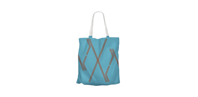
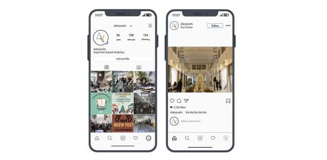
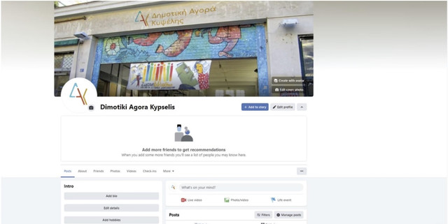
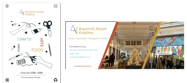
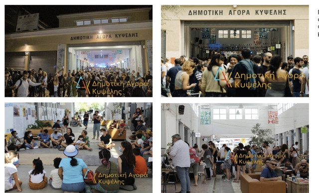
The project was carried out in 2023 and concerned the rebranding of the Kypseli Municipal Market. It involves the design of the logo, core corporate-identity applications, and a brand manual for the Market. The goal is to create a cohesive and attractive identity that will highlight its importance to the local community and promote its reopening. The work lasted a satisfactory period, in collaboration with a colleague, conducting thorough research, visiting the market itself before its reopening, creating the logo, main corporate identity (business card, envelope, letterhead), mugs, tote bags, posters, banners, t-shirts, signage, tags, pins, digital applications, design regulations, colour-system usage, typography, layout, prohibitions, etc.
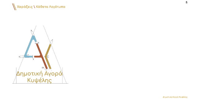
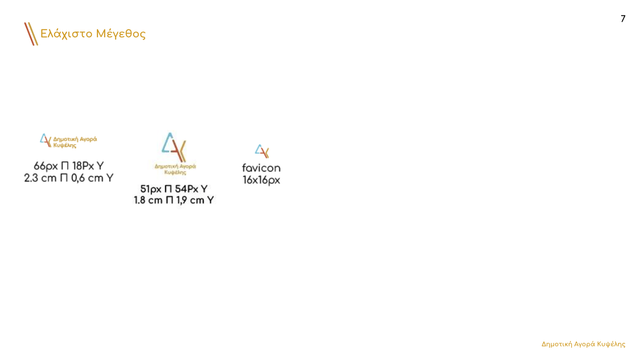

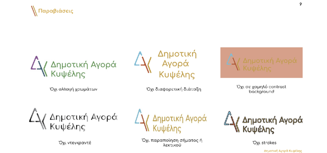
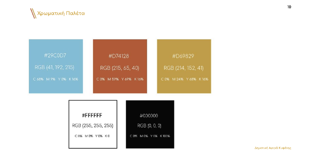
Logo Applications

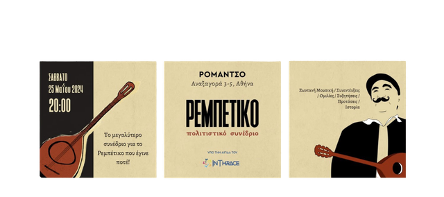
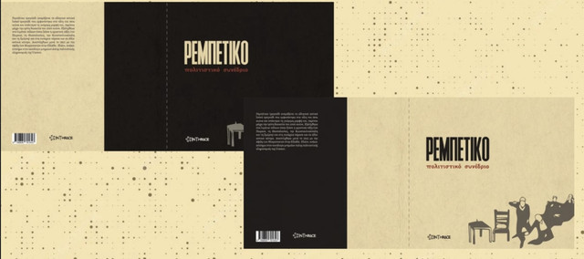
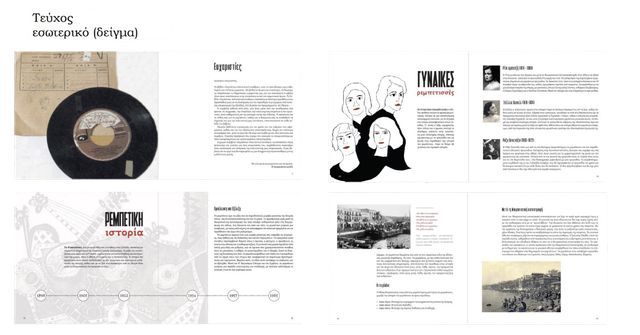
Campaign for the Intangible Cultural Heritage of Rebetiko
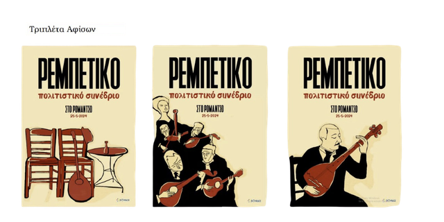
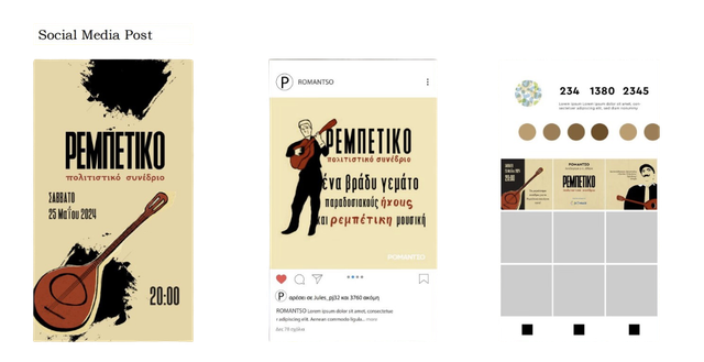
As part of the InThrace campaign project, our team of three aimed to create a logo and a slogan that would reflect the value of intangible cultural heritage, focusing on rebetiko music. We developed a series of three posters, as well as print advertisements and social media posts. Our work, among others, was selected to be included in a presentation article at the 12th International Conference on Strategic Innovative Marketing and Tourism (ICSIMAT 2025) in Pieria, Greece.

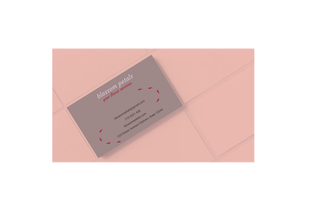
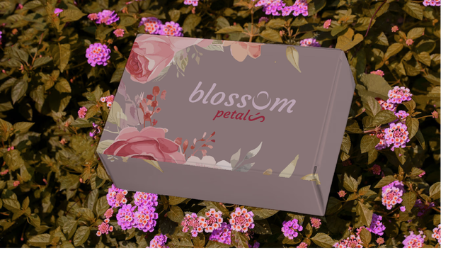
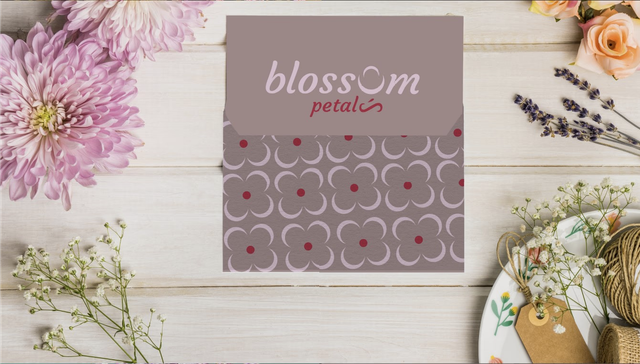
Personal Brand Design Project – Blossom Petals Flower Shop
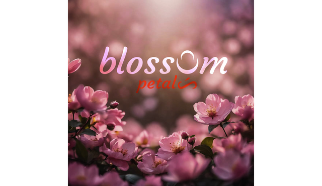
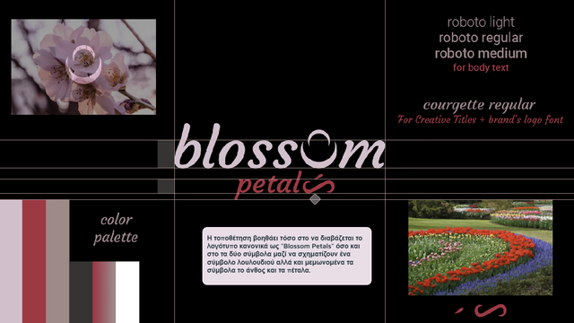
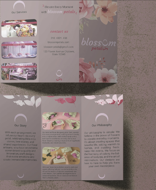
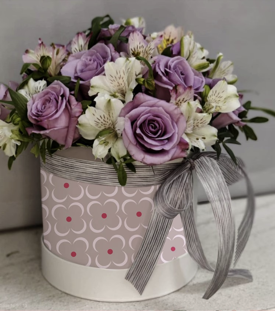
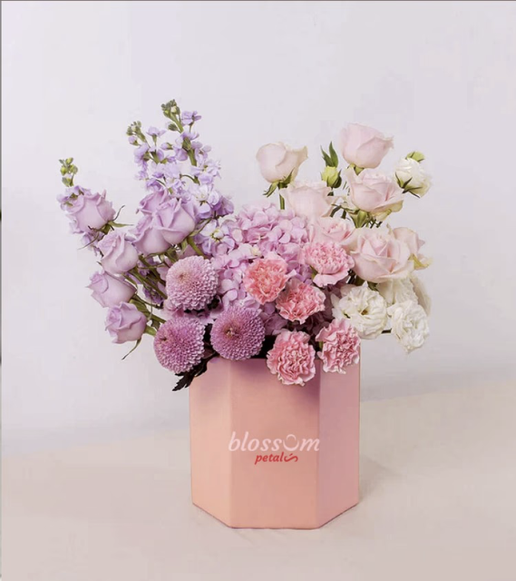
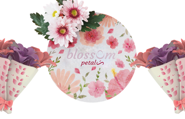
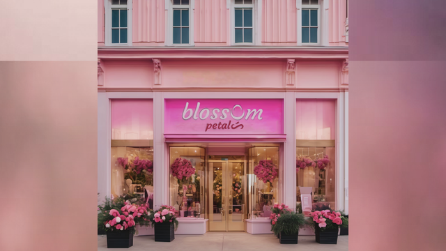
For my personal project 'Blossom Petals', I created full branding for a flower shop. My goal was to capture the essence of natural beauty with an elegant, soft design. The logo features a unique twist — replacing the 'o' in 'Blossom' with a crescent moon shape to symbolize growth and natural cycles. A bold red as a contrasting accent to the soft pink aesthetic adds vibrancy, and the 's' is replaced with a petal-path shape, creating symbolic typography and a logo that follows semantic rules, forming a recognizable identity — crucial for a brand. The project was aimed at Behance, so English was used.





See more work
Explore the full portfolio – UX, visual design, branding and more.